Because I drew the lineart for this Cholma piece on bristol board, I ran out of space to really fit the cape in. I barely got the top hand in! So the cape was added after in Photoshop. It took a couple tries to get a shape I really liked, but now I’m super happy with how it turned out. Also, having the cape means Cho’s butt doesn’t look too scrawny anymore!
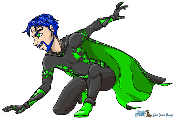
To make the addition, I used the magic eraser tool to erase the background behind Cholma (it used to be white pixels), giving me room to draw behind on a new layer. I sketched the shape I wanted a few times and then dropped the opacity on that layer to around 20% to use as a guide for inking with the Pen tool. I used a few different brush sizes when doing Stroke on the Pen lines to imitate the variable line widths I use hand inking, and then I colored the cape’s base colors in with the Pencil tool on yet another layer under the new lineart. I didn’t want the dithering from the pen tool to mess with my crisp cell shading, so that’s the reason for the extra layer. Normally I scan lineart in Bitmap mode (true black and white) so there’s no dithering and I can select color areas for shading without fussing with that. I then used the same multiple shading layers I described on this GlitterFey drawing.
