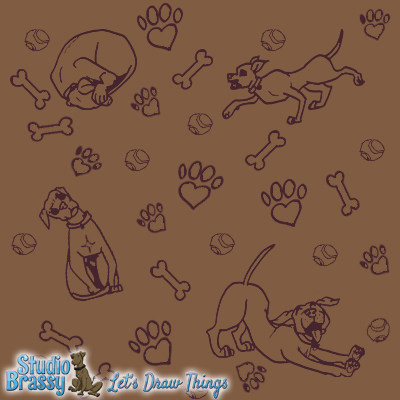
Here’s a shot of the repeating dog pattern that’s currently on the website. It’s Tank, of course, since he adorns everything Studio Brassy-related. I just did some simple sketches in my sketchbook, scanned, did minor cleanup, then arranged them and did a single color overlay. On the site, the background image is actually a transparent .png, so if I felt like it I could change the background color to whatever I wanted and still keep the dark raisin-colored cavorting dogs.

You may have noticed my new watermark recently – it’s neat! I love it. It’s the new website header plus a fancy version of the tagline that I had made up for my new business cards and now I’m sticking it on everything. It’s certainly a lot more convenient than typing studiobrassy.com on everything and picking the right font for the feel of the piece and blah, blah, blah, I lost you after “the right font,” didn’t I?
My favorite Tank is the stretching one. He’s just so happy, and Tank is constantly showing off his down dog skills anyway.
